

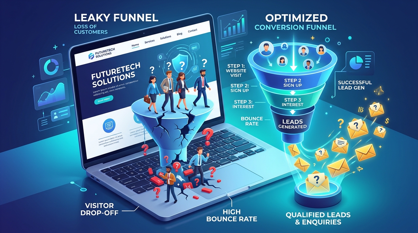
This is one of the more frustrating situations a business owner can face. The website looks genuinely good. Friends and colleagues compliment it. The design agency delivered exactly the polished look that was asked for. And yet, month after month, the number of actual enquiries coming through stays stubbornly low, while traffic numbers in the analytics dashboard look perfectly reasonable.
The instinct, in this situation, is usually to question the traffic — "maybe we just aren't reaching enough people." Often, though, the real issue is sitting one step later in the journey: people are arriving, but something between arrival and action is quietly letting them slip away.
It is worth being clear about what this article is, and is not, addressing. If your website genuinely receives little to no traffic, the fix starts with visibility and marketing, not conversion design. This piece is specifically for the situation where visitors are already arriving in reasonable numbers, yet the enquiry count stays disappointingly flat, because that particular gap tends to have a different, more fixable set of causes than a traffic problem does.
Why This Gap Matters So Much
A website that attracts visitors but does not convert them is, in a very real sense, worse than a website that gets no traffic at all — because the hardest part, getting someone's attention, has already succeeded. The failure is happening at the cheapest, easiest-to-fix stage: the final few seconds where a visitor decides whether to act or move on. Every visitor who leaves without enquiring at that point represents marketing spend, SEO effort or word-of-mouth goodwill that effectively went nowhere.
Common Mistakes Behind Low-Converting "Pretty" Websites
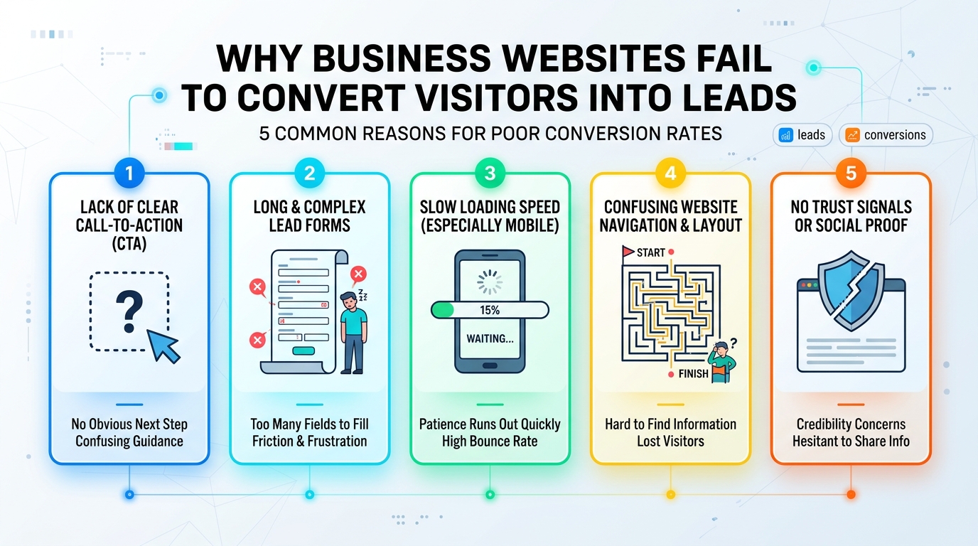
1. No single, obvious call to action
When a page has several competing buttons — "Learn More," "Download Brochure," "Follow Us," "Contact," all with equal visual weight — visitors often do none of them, simply because nothing was made to feel like the obvious next step.
2. Enquiry forms that ask for too much, too soon
A long form asking for full address, budget range and project details before a visitor has even decided to trust the business will lose people who would have happily sent a short message.
3. Design that prioritises aesthetics over clarity
Striking visuals, heavy animation or clever layouts can sometimes bury the actual message. If a visitor has to work to understand what you do or why it matters to them, many will not bother.
4. Mismatched messaging and visitor intent
If someone arrives searching for "same-day AC repair" and lands on a beautifully designed but generic "About Our Company" page, the mismatch alone can cause an exit, regardless of how good the page looks.
5. Slow load times undoing good design
A gorgeous page that takes eight seconds to load on mobile data has already lost a meaningful share of visitors before they ever see the design at all.
6. No reassurance near the decision point
Right where a visitor is deciding whether to commit to an enquiry, many sites offer nothing to reassure them: no mention of experience, no visible contact details, no simple answer to "is this safe to try." Without that small reassurance, hesitation often wins over action.
Why Analytics Alone Does Not Tell the Full Story
It is easy to look at a dashboard showing reasonable traffic, decent time-on-page and a healthy bounce rate, and conclude the website is "working." Those numbers describe whether people stayed and looked around. They do not describe whether the page successfully guided anyone toward actually contacting the business. A visitor can thoroughly enjoy a beautifully designed page, scroll through every section, and still leave without ever being given a clear, low-friction reason to take the next step. Traffic and engagement metrics measure attention. Conversion is a separate outcome that has to be designed for specifically, not assumed from good-looking numbers elsewhere in the report.
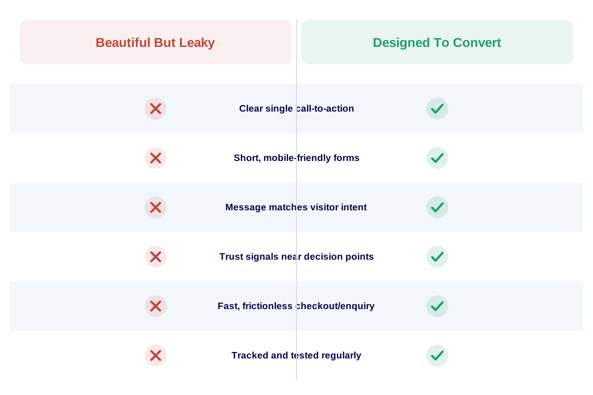
Looking good and converting well are related, but they are not automatically the same thing.
What Is Really Happening Beneath The Surface
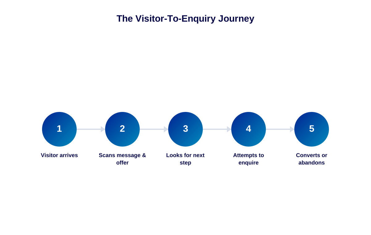
Conversion problems are usually invisible to the people who built the site, because they already know where everything is and what each page is trying to say. A new visitor does not have that context. They are scanning quickly, often on a small screen, often distracted, and they are looking for a reason to either act now or leave. Beautiful design earns attention. It does not automatically earn action — that requires deliberate structure: a clear message, a clear next step, and as little friction as possible between the two.
It is worth separating two different jobs a website page performs. One job is to make a strong impression — visually, tonally, emotionally. The other job is to guide the visitor toward a specific, simple action. A talented designer can excel at the first job while never being asked to think seriously about the second. Unless conversion is treated as a deliberate design requirement, with its own goals and its own review process, it tends to get assumed rather than actually built.
An Illustrative Scenario (Not an Actual Client Case)
Imagine a boutique travel agency in Kerala that invests in a visually striking website full of destination photography and smooth page transitions. Visitors spend a reasonable amount of time browsing, and the bounce rate even looks healthy in analytics. Yet enquiries stay flat month after month.
A closer look reveals the enquiry button is a small text link at the bottom of a long page, the enquiry form asks for eleven fields including passport number before any conversation has even started, and nothing on the homepage directly addresses what a first-time visitor is actually trying to decide — "can this agency plan the specific trip I have in mind." The site is beautiful. It is simply not organised around getting someone to take the next step, and so most visitors quietly admire it and leave.
Had the team running that site compared enquiry numbers against traffic volume sooner, the gap might have been noticed months earlier. Instead, it took a deliberate review, prompted by flat growth, to reveal that the problem was never about attracting interest. The interest was already there. It simply had nowhere obvious and easy to go.
Practical Solutions and Recommendations
- Pick one primary call to action per page and repeat it, visually consistent, at natural pause points.
- Shorten enquiry forms to the minimum needed for a first response: name, contact detail, and a short message.
- Make sure the first screen a visitor sees answers "what is this, and is it for me" within a few seconds.
- Match landing page content to the specific search terms or ads that bring visitors there.
- Test the enquiry journey yourself on a mobile phone, start to finish, at least once a month.
A Step-by-Step Conversion Review Checklist
- Identify your single most important call to action on each key page.
- Check how many clicks or scrolls it takes a new visitor to find it.
- Review your enquiry form and remove any field that is not essential for a first reply.
- Read your homepage headline as a stranger would — does it say what you do, for whom?
- Check page load speed on mobile and compare it against your own patience threshold.
- Track enquiries against traffic over a few months to see whether changes are working.
The Business Cost of a Conversion Gap
We cannot responsibly quote a specific number of "lost enquiries" without real data from your own analytics, and any figure offered without that would be invented. What is reasonable to say is this: every visitor who leaves without acting is a visitor you likely paid to reach, in time, effort or money, and did not get the return on. Fixing conversion issues is often far cheaper than finding more traffic, because it makes the traffic you already have work harder.
There is also a compounding effect worth noticing. A business that doubles its advertising spend without first fixing a conversion leak is, in effect, pouring more visitors through the same gap rather than fixing the gap itself. Improving the page's ability to convert existing traffic is almost always the higher-leverage move to make first, before spending more to attract additional visitors into the same leaking funnel.
How to Identify the Right Partner for This Work
Not every web design agency thinks about conversion. Many focus purely on how a site looks. When evaluating a partner to fix this kind of problem, ask them directly how they approach calls to action, form design and mobile usability, not just visual style. A partner experienced in both web design and structured website development will treat appearance and performance as two parts of the same job, not separate concerns.
At Gravity Innovative Solutions, every site we build is approached with both goals in mind from day one — a design that looks right, and a structure built to actually turn visits into enquiries. For an existing website that already looks good but is underperforming, this often means a focused conversion review rather than starting over, which tends to be faster and more cost-effective for the business.
Conclusion
A beautiful website that does not convert is not a lost cause; it is usually a focused fix, not a full rebuild. Start with the call to action, the form, and the first few seconds of the homepage. Those three areas, more than any visual redesign, tend to decide whether a visitor becomes an enquiry or simply closes the tab.
It is also worth revisiting this review periodically rather than treating it as a one-time fix. As you add new pages, run new campaigns, or shift your offering, the same questions about calls to action, message clarity and form friction are worth asking again. A conversion-friendly homepage today can quietly drift out of alignment with visitor expectations a year or two later if nobody is actively watching for it.
Your website should do more than simply exist online. It should build trust, attract the right audience and support your business goals.
If your traffic looks fine but enquiries do not match it, let us take a look together.
Related reading: Does Your Website Look Professional Enough to Earn Customer Trust? and Is Your Website Mobile-Friendly, Fast and Ready for Today's Customers?